New Minor Version: 1.1
Published
After a long and relaxing summer we're finally back in action. To start things off we're releasing a new minor version packed with new functionality: VCC UI 1.1.
New Components
The most notable addition in this release are the new components:
Text Component
Typography has been a source of major brand inconsistency in our digital products. As a result a <Text> component has been one of the most requested feature for a while now. We've worked closely together with the Design System team to deliver this.
The <Text> component will allow you to select from a number of text styles
that are aligned with the upcoming Volvo Cars Design System. The text component
also has a baseline grid setting implemented which will create a perfect
vertical rhythm on your page.
Live Demo:
Head over to the Text component documentation for a full disclosure!
Spacer Component
Another source of inconsistency has been the use of space (eg.
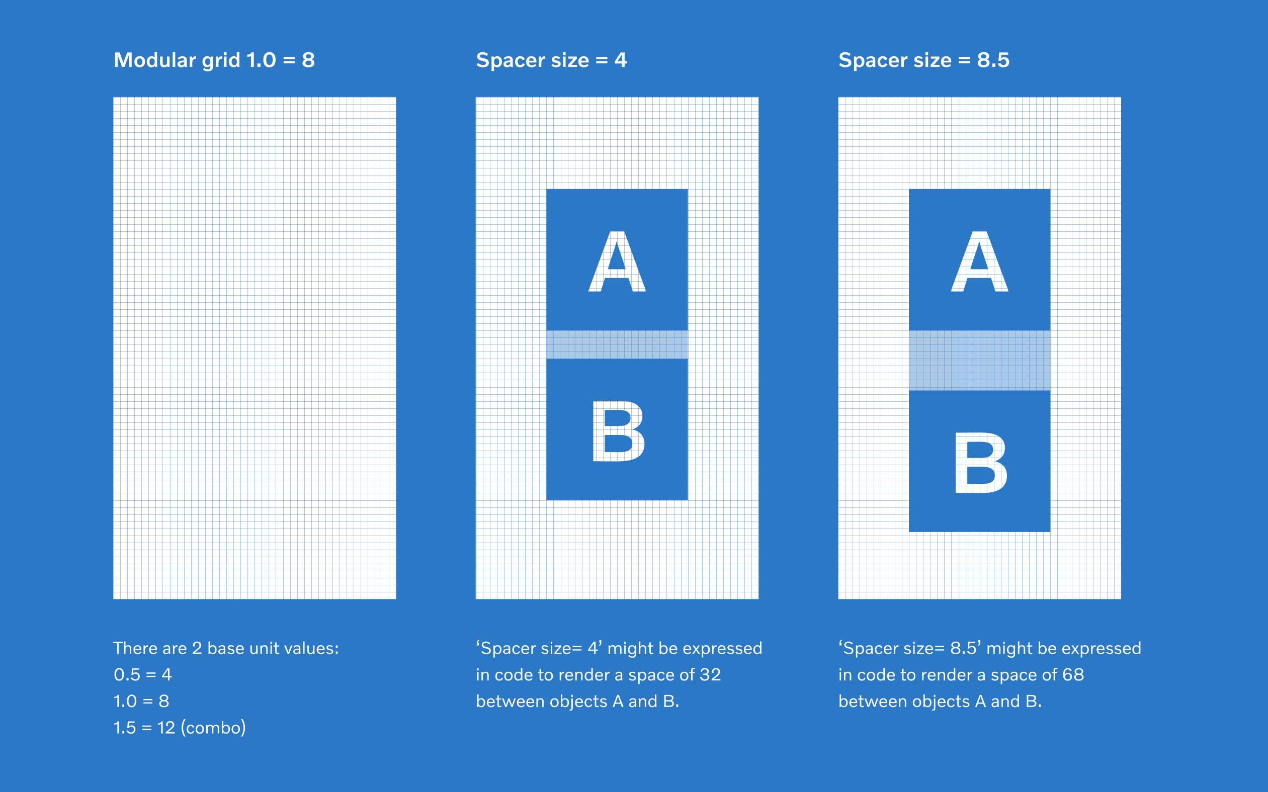
margins and paddings). To deal with this, we're introducing a modular grid and a <Spacer> component.
On the web, the modular grid is simply a multiple of 8 pixels (macro grid size). You can also multiply with 0.5 points to adjust to a "micro grid size", eg. 4 pixels. The default spacer size is 1, but can be changed via the size property.

Live Demo:
Since we are using flex-basis to apply the space, it's directionally independent. Try changing flexDirection to column and you'll see that the space is applied according to the directional flow of the components. Check out the Spacer component documentation for more!
StyleTags Component
Server Side Rendering just became a lot easier. Instead of creating your own
<style> tags and injecting them into <head> you can now just use the StyleTags
component to achieve the same thing.
<head>
  <StyleTags renderer={this.props.renderer} />
</head>
We're already implemented it on this site, checkout the diff to see how it's done.
Notable Changes
Apart from new components, we also have a few other noteable changes and improvements in this version:
Refactor TabNav component
We've introduced a new simpler API (backwards compatible)
- Removed react-transition-group as a peer dependency
- You can now pass your own sticky elements (not just back button)
Renamed Box to Flex
We've deprecated the Box component, it has simply been renamed to Flex, in order to align with the future naming conventions of VCC UI 2.0 core components.
Other improvements and fixes:
- Renamed the altText prop on
<Logo>to alt (#246) - Fix incorrect documentation and prop types for
<Click>component - Add rel=noopener to
<Link>and<Click>components with target=_blank - Refactor class components to be function components with hooks